
Fashion
Gillian Anderson on Playing The Crown’s Iron Lady
On season four of the Netflix hit, the actress takes on the role of a lifetime as British prime minister Margaret Thatcher….


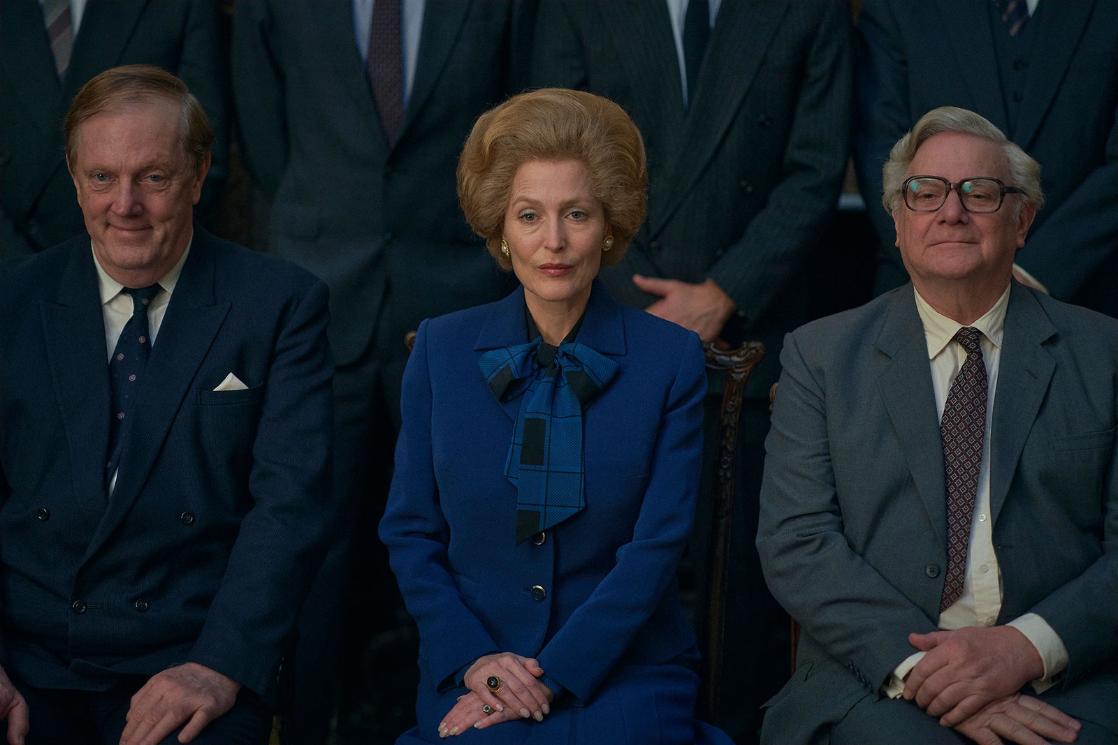
The creations of The Crown’s costume designer, Amy Roberts, also informed Anderson’s transformation. Known for her Aquascutum suits, sensible Asprey handbags, and an immovable bouffant hairstyle, Thatcher’s version of power dressing was a crucial part of her image. Getting the look right involved trial and error on everything from the tailoring to finding accurate makeup for the era. “I was sitting in the hair and makeup chair while they were trying to work out their contributions, and when I would get closer to looking like her, I would take pictures of the mirror because it was like, ‘Oh my God, oh my God. Look, there she is.’” says Anderson. “That was quite a long process. [Finding] the particular blue eyeshadow that felt like it was from the ’70s and ’80s, but it wasn’t quite so opaque, and the particular base that wasn’t too heavy for 4K HD. All of those choices very carefully thought out. So when they would try different versions of things, some looked more like her than others and it was always exciting when we got closer.”
In recent years, actors have disappeared into their roles as famous figures through the use of undetectable prosthetics or CGI magic—think Charlize Theron’s uncanny Meghan Kelly in Bombshell or computerized anti-aging allowed Robert DeNiro to play three decades in the life of gangster, Frank Sheeran in The Irishman. Technology’s helping hand can enhance performance, but Anderson opted to go the old fashioned route. She embodies Thatcher through subtle changes in posture, voice, and movement, a decision she felt appropriate. “We were a similar age, so it didn’t feel like I would need to make myself look older,” says Anderson. “We have a similar nose; we have somewhat similar eyes as we’ve both got hooded eyelids.” Initially, the idea of wearing a dental prosthesis was floated, but it proved distracting. “She had very distinctive teeth. They weren’t great, and she had them capped a couple of times while she was in office,” says Anderson. “Someone built a prosthesis that matched, but it was too much and didn’t look natural at all. We tried different ways of coloring and staining, making a gap, but in the end, we decided against it. [Instead] I figured out a way to hold my mouth so that I had more of an overbite. The mixture of that, the tilted head, and her movements wound up being enough.”

Entertainment
A$AP Rocky Turned An Entire Manchester City Kit Into His Album Rollout
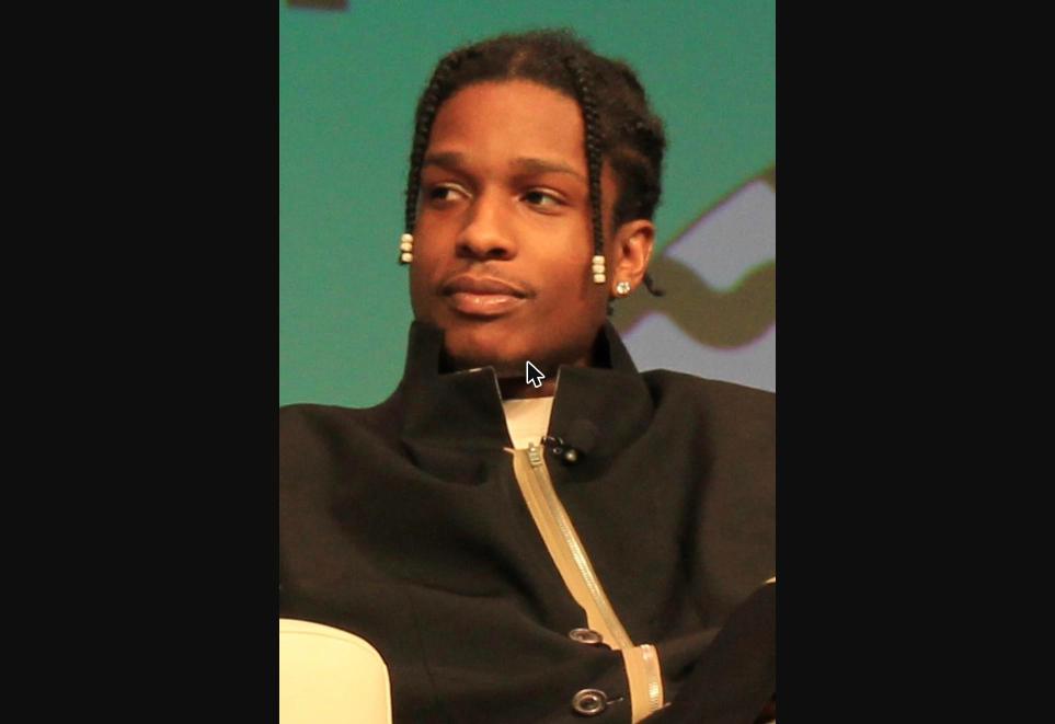
A$AP Rocky doesn’t do album rollouts quietly, and this one recruited an entire Premier League club to help. Manchester City, PUMA, and Rocky teamed up on a limited apparel run tied to “Don’t Be Dumb,” his 2026 album, timed around his September 5th show at Co-op Live.
The centerpiece is a long-sleeve PUMA King jersey in black and archive gold, with “DON’T BE DUMB” running down the sleeve and AWGE branding worked in throughout. A bold “MANCHESTER” graphic covers the back. Fans could also add limited “A$AP 11” name-and-number printing onto the club’s actual Home, Away, or Third kits, while supplies lasted at retail.
There’s a players-only version too, and it never went up for sale. That one sticks closer to City’s usual sky-blue identity, with its own sleeve detailing and back graphic — the kind of piece that exists purely because a handful of people got lucky.
The whole rollout kicked off with a one-night pop-up on September 4th, when PUMA turned a spot in Manchester’s Northern Quarter into a pop-up cafe for the night, mixing football, music, and street style into one room before the wider release hit the stadium store the next morning. Some of those jerseys even came with golden tickets to the concert or that Saturday’s match.
Rocky has called the project true to his own design language, and it’s not even his only club collaboration this cycle — a similar drop with AC Milan landed around the same time. At this point, the line between fashion week and matchday has basically disappeared.
Entertainment
Quavo And Lids Are Going All In On Atlanta With Their New Cap Pack
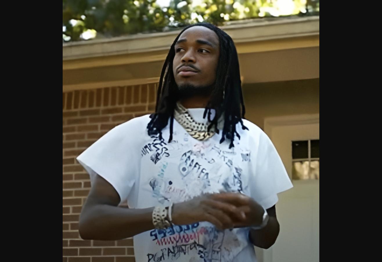
Quavo has never been shy about his hat obsession, and Lids just gave him another outlet for it. Their new “Atlanta” pack drops September 12th, marking another round in a partnership that’s been running strong since 2019.
The collection is a love letter to the city, spread across three very different caps. One mashes up pinstripes, script lettering, and Braves branding into a single design, working navy, red, white, and light blue into the mix. Another goes the opposite direction entirely — fully iced out in crystal detailing, done up in black and red, with both the Falcons and the Braves showing up in the design. The third strips things back to an old-school “ATL” trucker cap in red, white, and gold, the kind of understated piece that lets the city’s name do the talking.
None of this is new territory for Quavo. He’s talked before about waiting on hat releases as a kid, and that same excitement seems to be what’s kept this partnership going years past most celebrity collabs. His earlier Lids run leaned on one moment — the Braves’ 1995 World Series win — but this pack pulls from the city’s whole sports history instead of just one highlight.
Lids has called Quavo one of the rare voices who can blend music, fashion, and sports without it feeling forced, and this drop backs that up. Given how fast his past releases have moved, Atlanta might want to set an alarm for September 12th.

-

 Artist Spotlight6 days ago
iLLLACAT brings sharp bars and catchy production with latest release “Like Dat”
-

 Artist Spotlight6 days ago
Joshua Jamison unveils intimacy and a full rock expression on latest release “Windows”
-
 Artist Spotlight6 days ago
ALPHA CENTAURI blends hip-hop, funk and afrobeat ambition on latest release “The Future Right Now”
-
 Artist Spotlight6 days ago
Emilie Thorsby turns self-belief into a bold musical statement with latest release “Amazing as hell”
-

 Artist Spotlight5 days ago
Amanda Fagan unveils lost love and regret on latest release “Forever Yearn”
-

 Artist Spotlight6 days ago
UNDAUNTED unveils broken memories with latest release “Shattered Echoes”
-

 Artist Spotlight1 day ago
“NO MORE” by Amanda Holley connects healing, awakening, and survival
-
 Artist Spotlight1 day ago
“Subterranean Homesick Blues” finds a new direction through Ghost of Panama